Our new Logo
We're excited to introduce a brand new CCSS logo.
August 17, 2022
With the beginning of the new academic year, we really thought it was finally time to give the CCSS a new coat of paint. After quite a lot of variation, we’re proud to present a symbol that we believe represents our program, community, and our mission as an organization.
Why we needed a new logo
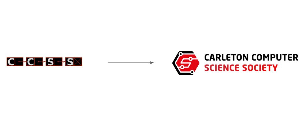
Although we loved our previous logo very dearly, there were some issues with its design.
The first main issue was the logo’s proportions. The thin rectangular proportions of our previous logo made it difficult to use in situations where a more “square” symbol would have been the norm. For social media profile pictures, we’d often use just the “C” from our logo, losing a lot of the recognizability a logo is supposed to have. We’d later start using a “square” version of our linked list shape, but that logo would also suffer from our next main issue.
The second main issue with our previous logo was that it was too detailed. The thin arrow-shaped lines that connected our “node” shapes were so thin you could barely see them at a distance. The letters in our logo also appeared crammed in and also did not read well if the logo was too small.
We also struggled with our old logo’s colour scheme. The abundance of black filling the main negative space of the logo made it only really look nice on darker backgrounds. We’d often substitute alternate colors when working with brighter colours or just make the whole symbol white.
How we made the new logo
When we started our new logo, it would have been easy to simply create some entirely new symbol. However, we really wanted to make sure our end product was something that wasn’t just modern, but also hearkened back to the roots of our previous logo and what it represented.
The main element we wanted to keep from our old logo was the idea of our logo featuring a graph. Our old logo was a linked list (a form of graph) and a core element of graphs is that they have connections between their nodes. The symbol of a graph and its connections parallels the interconnections among people we hope our members form with one another through our initiatives and community. It’s one of the few symbols within computer science we felt was appropriate for representing the general idea of a community. To take it one step further, we also made sure that our new shape also had four nodes, just like our previous logo.
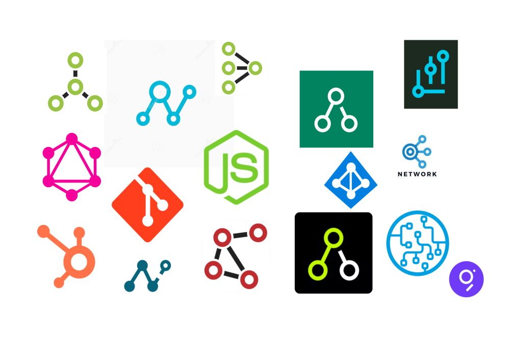
The issue with “graph-based” logos is they often feature a great deal of negative space. To avoid this, we eventually settled on the idea of creating a shape similar to the Git logo where the graph shape of our logo would act as the negative space within our symbol.
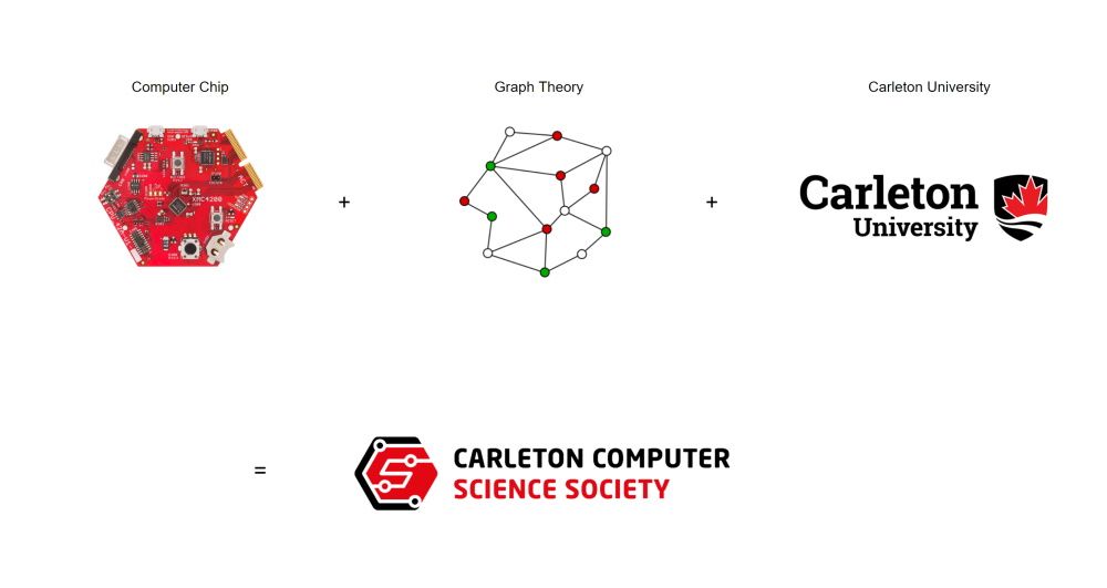
When trying to pick the “outer” shape of our new logo, we eventually settled on a hexagon-type shape. There was an idea that our logo could look like a “computer chip” of some kind, and the graph shape we wanted to include could also act as the circuit you’d find on a computer chip. Most microchips are squares, but we found that a bit too plain, so we decided to go with a hexagon.
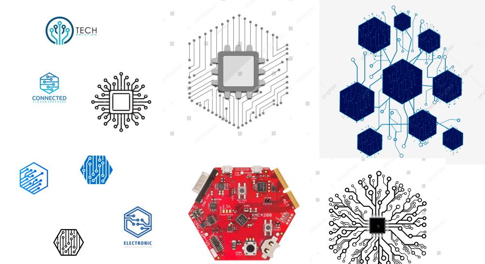
The idea behind our logo being a computer chip combined with a graph is that in combination these two ideas represents “computer science”. With the computer chip representing the “computer” aspect and the graph representing the science and theory aspect. After we had those ideas in mind, we started to create different variations of our new logo.
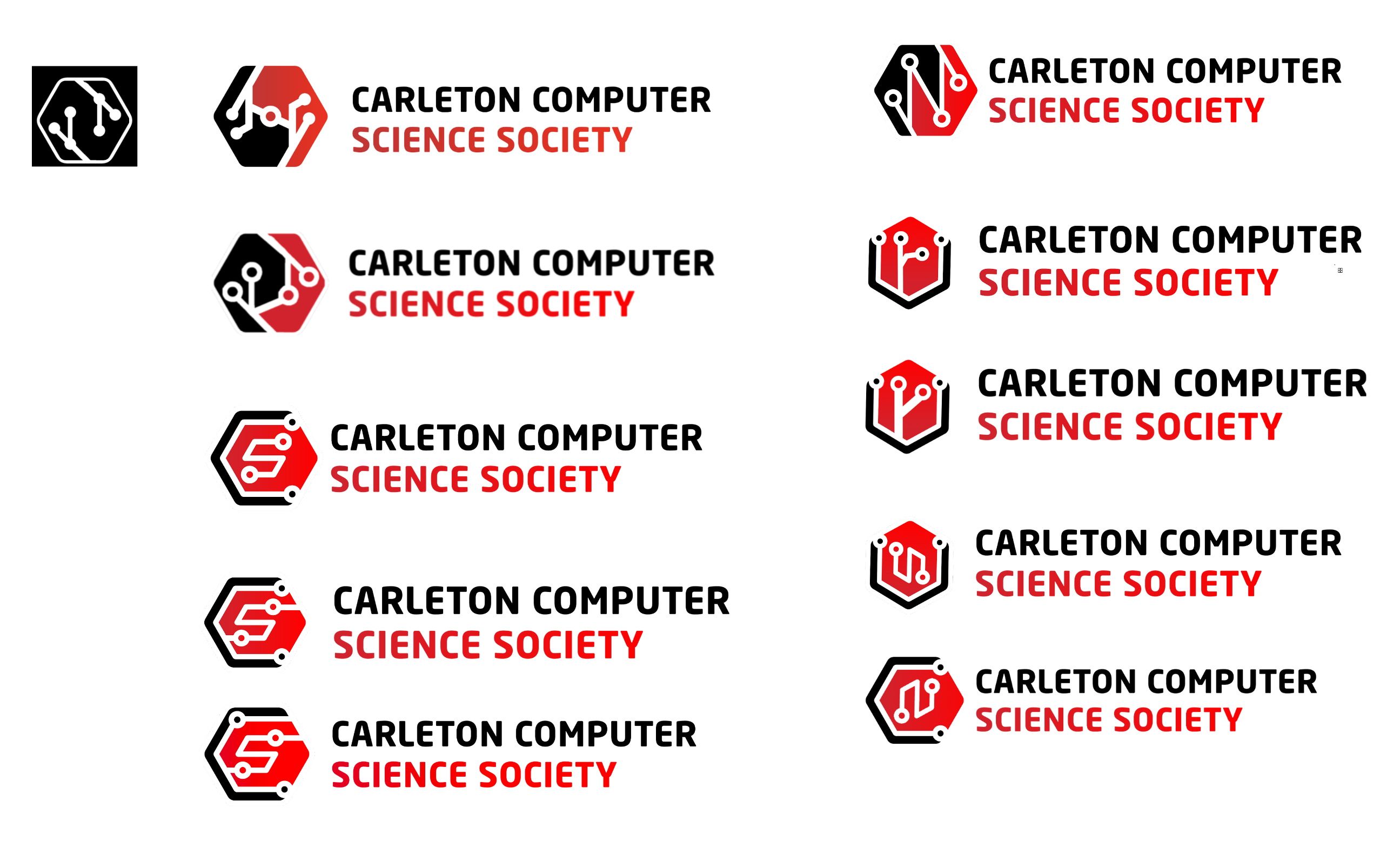
We picked our final variation because of the added aspects this variation had over the others. Hidden within the graph shape of this variation is the letters “CS” (computer science).

The inner “S” shape of this logo also parallels the strokes on Carleton’s logo that represent the Rideau River. This is definitely a bit of a stretch and wasn’t really intentional, but it is pretty cool.

Finally, we needed to pick our final colours. We decided to utilize the same colours as Carleton’s logo as described in the Carleton logo guidelines.
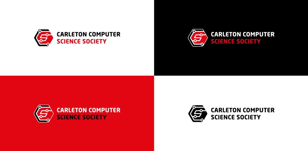
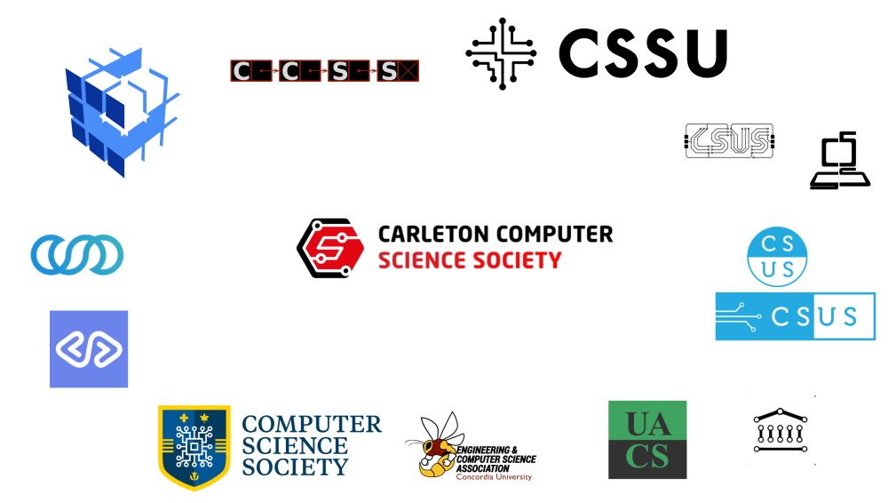
One last aspect of our design we wanted to ensure was that our logo stood out from our counterparts at other institutions. Below is our new logo next to the logos of other undergraduate computer science organizations from other Canadian universities.
Conclusion
We’re excited to introduce a new brand CCSS logo! We hope you’ll join us in welcoming our new logo this year when we return to in-person activity.
